Thorn Cycles pitch • Summer 2018
Uphill Challenge
outline
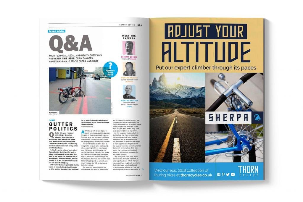
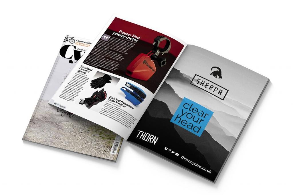
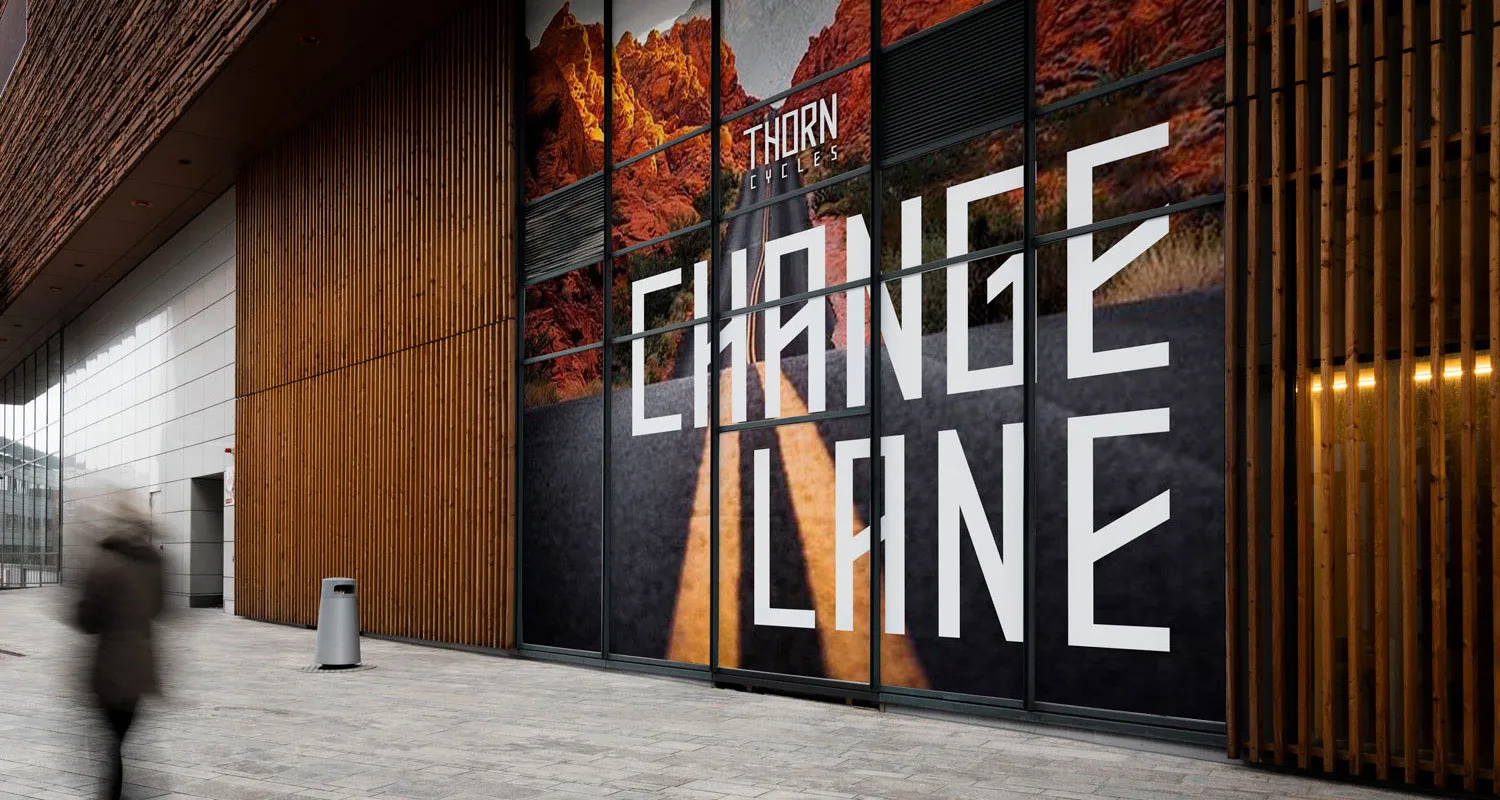
The UK’s road bike market has gained major momentum ever since the London Olympics, while mountain biking has always enjoyed traction with a hardcore following. Pitching a rebranding project to Thorn Cycles, I wanted to inject that same pride and passion into the touring bike sector. Thorn are a British manufacturer of specialist touring bicycles based in Somerset. Not completely re-inventing the wheel, but certainly helping the brand go up a few gears. Photo below of Tuscany by Sankai on iStock.
CLIENT
Thorn Cycles / Branding Pitch
scope
- Branding
- Copywriting
- Outdoor Posters
- Pop-Up Banners
- Print Advertising
- Social Media Assets
- Website Design

Challenge
An uphill challenge to persuade a traditional business to embrace change. We met at the top with a shared vision.
context
Touring cycling runs through my family’s veins. My Father and Grandfather were both avid cyclists, touring around France and Germany in their youth. Time to channel my passion for cycling in tandem with my love of graphic design. I spent a few months rebranding Thorn, demonstrating innovation across their print, digital and social landscapes. Legacy was also important. Rebranding an established business should honour and preserve their history, while adding a new spin. The result was a fluid brand ecosystem to help Thorn grasp new opportunities both locally and online.

Original logo
New logo design
Typography
Mastodon is a decorative typeface designed by Apostrophic Labs. It was carefully sourced for its angled letterforms to convey the geometry of a bike frame. In particular, the letter ‘Y’ echoes the shape of the handlebars. The typeface only features uppercase characters and with just three font weights.
Raleway is an elegant sans serif typeface, designed in a single thin weight by Matt McInerney originally published by The League of Moveable Type. It is a crisp highly legible typeface perfect for paragraphs of body copy, inspired by geometric sans serif typefaces.
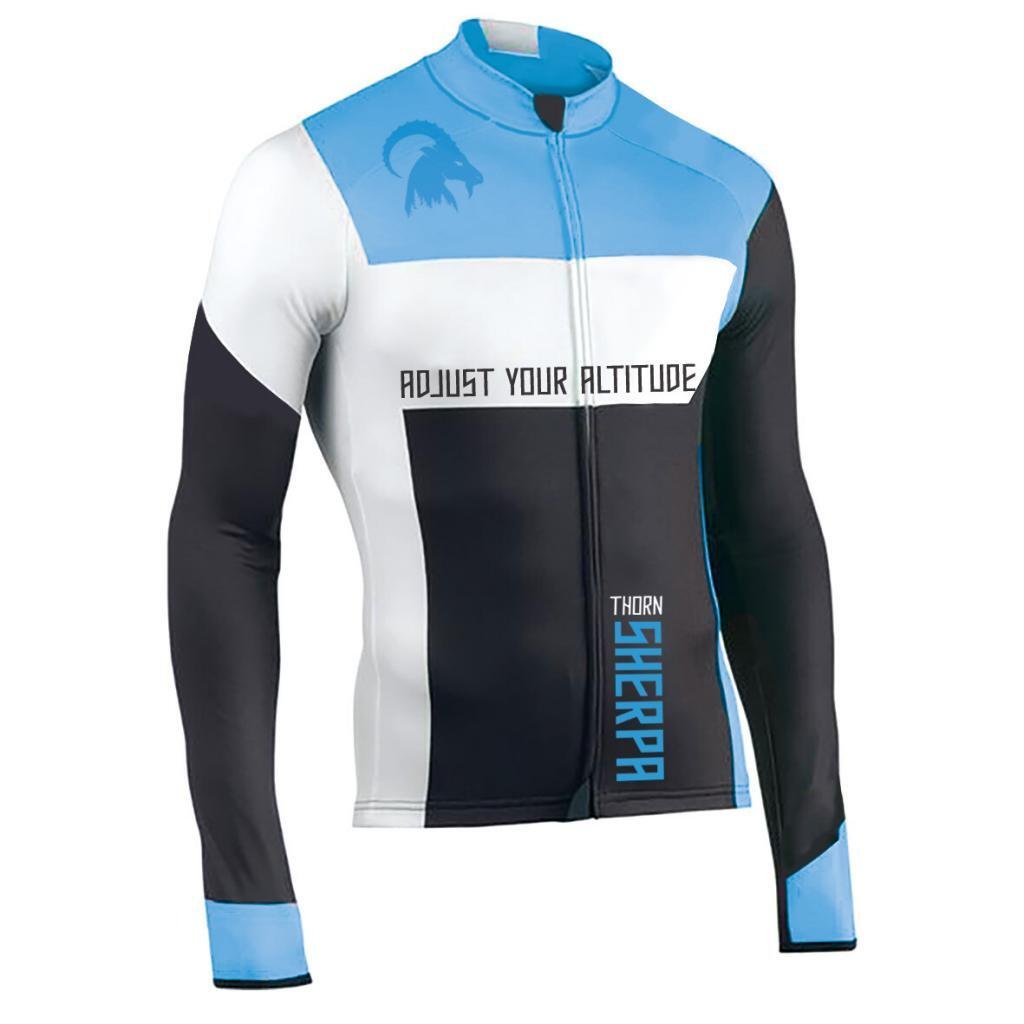
Wearable promotions
Puncture proof branding.


website development
Joining the cycle superhighway.
The Thorn website required a full service. The navigation had 13 different categories, which has a huge impact on conversions, sales, and bounce rates. I streamlined this to six headings in line with best practice. Book a test ride, find a dealer, cycle hire (a new service) and recycling services have all been given more prominence and now sit above the fold, directly below the main hero images. The homepage copy was rewritten and greatly expanded with SEO firmly in mind. Altogether a slick, well-oiled user experience.


