Brand Evolution • Autumn 2019
FEMS Branding
outline
Federation of European Microbiological Societies (FEMS) is made up of an active and diverse network of around 30,000 professionals who are committed to advancing microbiology. Set up in 1974, today they are a growing coalition of more than 50 member societies. Their original logo dates back to 1977, when the first issue of FEMS Microbiology Letters rolled off the press. This branding project was a case of ‘evolution not revolution’ and the new logo needed to embody the client’s complex demands.
CLIENT
Federation of European Microbiological Societies
scope
- Annual Reports
- Branding + Guidelines
- Exhibition Materials
- Journal Covers
- Social Media
- Stationery Sets

Challenge
Represent the vastness and diversity of the microbiology community.
logo solution
As a shape, the ‘pentagon’ is found widely across nature. It represents a blend of the smallest aspects of microbiology. The dynamic outer particles of the logo structure can represent many things, from an abstract group of colonies growing on agar at a macroscopic level, or a single cell, and all the way down to protein structures. The grouping of many smaller pentagons into a larger pentagon also represents the function of FEMS, bringing many microbiologists, in many diverse societies, into a type of order and structure. The pentagon also highlights their five key pillars of Engagement, Education, Business, Research, Policy.
Original logo
New logo design
Typography
Museo is a contemporary semi-slab serif font family designed by Jos Buivenga. His love for the uppercase letter U inspired this unique set of fonts. “Museo, it all started with my love for ‘U’. This uppercase letter U came to me as an image in a daydream with both stems bend into semi-slab serifs.” Museo is a remarkable semi-serif family with simple, open forms and highly original details.
Droid Sans is a humanist sans serif typeface designed by Steve Matteson, Type Director of Ascender Corp. Droid Sans was designed to provide optimal quality and legibility. It features upright stress, open forms and a neutral appearance. Droid Sans was optimized for user interfaces and to be comfortable for reading on mobile devices and on web browsers.
Selection of initial logo concepts presented.
Animated version of the logo for the launch.

social media assets
Sharing knowledge on social media.
FEMS mission is to advance the visibility and reputation of microbiology by helping to connect people and share knowledge, without borders or barriers. We utilised Instagram Stories to communicate their strategic ‘five pillars’ to a wider audience than would be reached through a traditional annual report.

journal covers
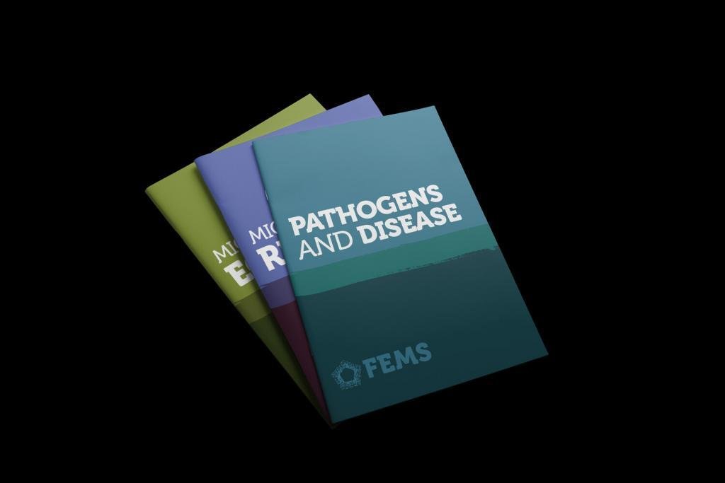
Inspired by Rothko’s fields paintings
The FEMS colour palettes were sampled from a selection of Mark Rothko paintings. His expressionistic ‘fields of colour’ artworks provided a scientifically based spectrum for each of the seven Journal covers. Interestingly, the artist’s daughter worked in the scientific field, as a doctor specializing in clinical pathology.


