

Branding
Battle of the brands
Branding is playing an ever increasing part in our lives, our politics, our sports, our culture and even our nation but what exactly do we mean by the word ‘brand’?
insights blog

Photo by Tim Mossholder on Unsplash
Hello and welcome to another blog post from Garlic. The top ten tips featured here will help you groom your marketing materials so they are dressed up and ready to hit the town!
Good design makes information accessible. Design is all about communication and typography is one of the most crucial elements. Despite the importance of typography it is probably one of the least understood areas of design. Typography is not typing.
Type is all around us and is one of the most important principles of design. Considered typography will enhance your marketing messages, in the same way bad typography will distract from the message. In today’s world, good design and a strong message are crucial because our world is increasingly visual. Please take a few minutes to read our tips below and add that touch of typographic finesse to your company’s image.
Each one of the 100,000 plus typefaces in existence has a unique personality. Some are more approachable than others. Using different typefaces can really change the meaning of your marketing materials, whether they be online or offline. So tread carefully when choosing a font to speak for your brand – it’s not always a question of simply shouting louder. So now its time to reveal my typographic tips:
Use decorative or display typefaces sparingly. What are decorative typefaces you say? That would be Scripts, or really fun unique typefaces that are bold and exciting. Even though they are fun, you shouldn’t overuse them. These types of typefaces are meant to be used in just a few words at a time.
We read by recognising word shapes, rather than letter by letter. Serif fonts which have ascenders and descenders, giving words more distinctive shapes, are easier on the eye. Avoid using capital letters for sentences. Generally speaking use Serif fonts for body copy, and Sans Serif for headings or shorter passages of text.
Kerning (horizontal spacing) and leading (vertical spacing) both play vital roles in dressing up paragraphs of continuous text. Research shows that 9, 10 and 11 point type are the most comfortable for sustained reading. Increasing the font size won’t necessarily improve legibility. The design landscape is littered with mistakes, like making font sizes too small online, and inversely too big in printed materials. Spruce up your spacing, and utilise white space.
Never ever use more than 2–3 typefaces at a time. This is a classic graphic design error. Remember that less is more, too many typefaces can blur the focus of your message. Spend quality time researching and then testing the best fonts that accurately represent your product or service. Once approved, use these chosen couple of typefaces confidently and consistently across all of your marketing collateral. Initial font constraint will still allow freedom.
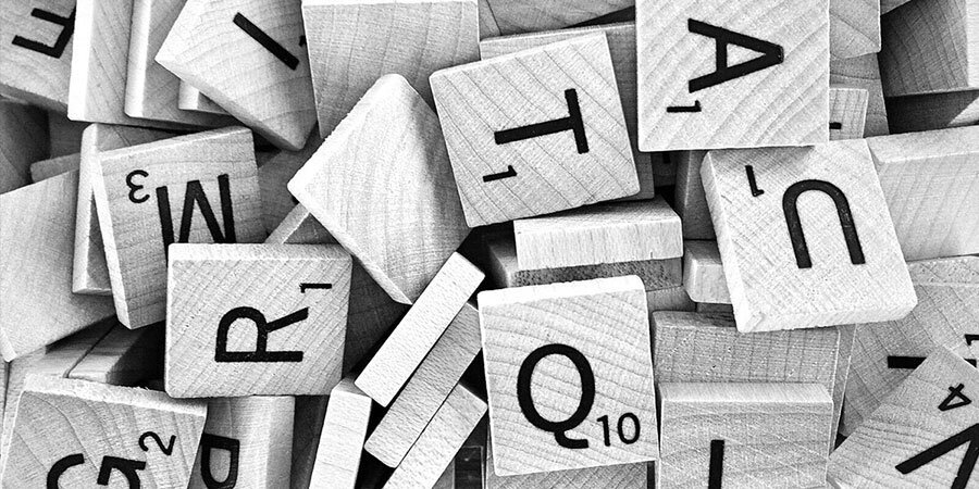
Did you know? The longest word you can spell using just a single row of keys on a standard qwerty keyboard is actually ‘typewriter’! The highest scoring Colins Scrabble game in the UK (using OSW scoring) was 793 by Peter Preston in 1999.
Like wearing socks with sandals, widows and orphans in paragraphs of copy interrupt the reader’s flow and are always unacceptable. A shrewd use of kerning (horizontal letter spacing) should be applied to style those rogue words.
You can choose either to purchase and download the physical font files onto you local drive. Alternatively, you can subscribe and license fonts from a font library like Google or Adobe Fonts. Wherever possible use the inherent font formats, rather than formatting within applications programs, as this is technically incorrect.
Colour can really lift type. Why not use coloured panels to highlight key messages? If small type is reversed out of a solid colour (white), it is wise to choose a heavier weight of typeface to avoid the text filling in as ink blurs around the edges.
Combining images with type is a real challenge. Like shampoo and conditioner they must work together, to produce effective results. Always keep typography clean and condition regularly. Invest in quality images and fonts because your marketing is worth it! The only website I’d recommend for free stock photos is UnSplash, which is now owned by Getty Images.
Garlic uses Adobe Fonts who offer an inspired selection of thousands of licensed fonts. Turn your internal and external marketing communications around, and build brand recognition with the use of creative, considered typography. Design work that always brings the flavour.
Branding is playing an ever increasing part in our lives, our politics, our sports, our culture and even our nation but what exactly do we mean by the word ‘brand’?
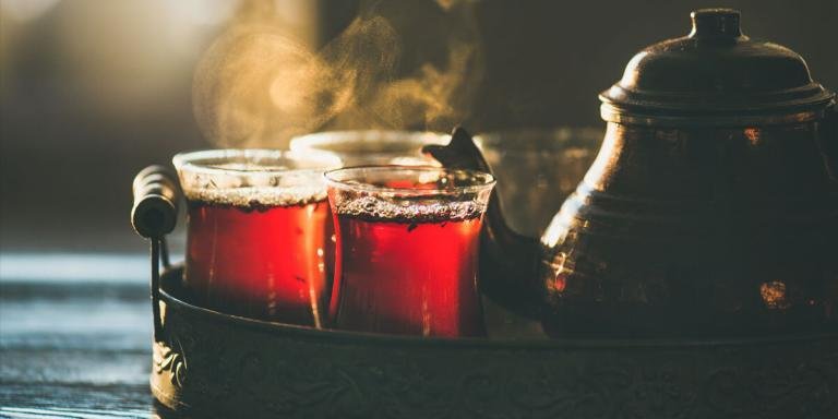
Today we visited Khedive Palace the former residence of Khedive Abbas II the Egyptian Governor, now a famous Istanbul landmark. The perfect spot to recharge our batteries and of course sample the tea!